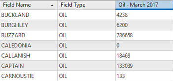
One of the features introduced in ArcGIS Pro is the ability to set a layer’s transparency based on an attribute value. As a quick example to demonstrate this, I am using some OGA oil production data for fields in the North Sea.
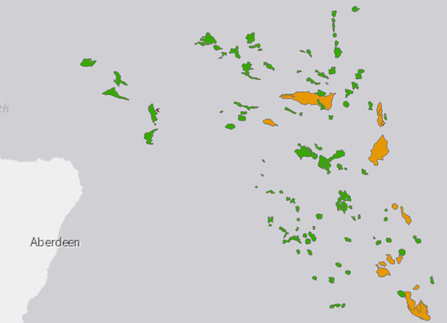
This is what the field data looks like to start with. I have symbolised it using the Field Type, showing the following types of production:
- Green = Oil
- Orange = Condensate
- Red = Gas
I’ll make this map more useful by using transparency to indicate production of each field, in the steps below:
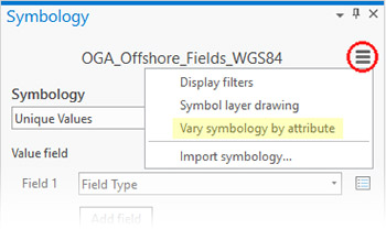
The dialog window which controls the transparency can be found in the Symbology dialog, by clicking on the ”burger menu” at the top right. This is highlighted with a red circle in the following screenshot. When the context menu appears, click on the Vary symbology by attribute.
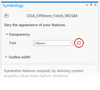
You can now see the options for varying the appearance of your features. Expand the Transparency tab and you will see a drop-down list of fields and a button for an Expression Builder (circled in red).
 The Expression Builder uses Arcade expressions. In this case I have used the attribute field containing March 2017 production values, but using Arcade you can create much more powerful expressions if you wish. Expression Builder sets a default title of Custom for your expression, but you can change this to something more suitable for your map. The Symbology dialog will retain this title. If you want to create numerous expressions, they will all appear in the Field drop down menu under Transparency.

In the example below, I’ve given the expression the title Oil Production March 2017, which is visible in the Field drop-down. Now that the expression has been defined, the data takes on the transparency. This next image is the result of the default values – fields with lower production are shown with greater transparency.
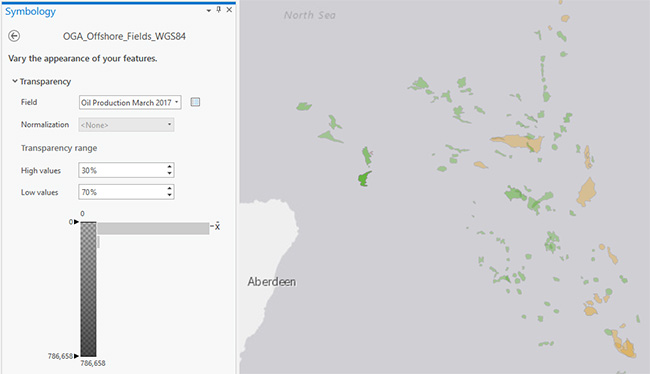
The classification slider in the Transparency range shows a horizontal histogram. This histogram allows you to see the distribution of data. In this case, there is an outlier, which is the oil field Buzzard. Because Buzzard’s production is so much higher, it is pushing the symbology for all the other values into a small range near the most transparent section of the symbology. To create a better visual of fields with lower production, I’ve dragged the Max Value slider up, so it only covers the first part of the histogram where most of the data exists. In the next screenshot I have also adjusted the High and Low transparency vales to 10% and 90% respectively. This makes the lower production fields more transparent and higher production fields more opaque.
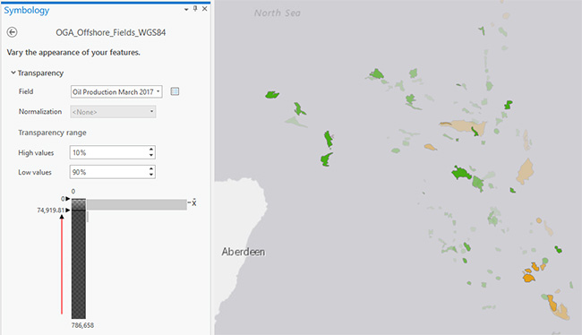
Comparing the last two images, you can see how this technique helps discriminate additional data attributes of interest. This is a relatively simple thing to do, thanks to the ability to use attributes to control transparency within ArcGIS Pro.
Written by Ben Holmes, GIS Consultant, Exprodat.
Links
- OGA Production Data: https://www.ogauthority.co.uk/data-centre/data-downloads-and-publications/production-data/
- OGA Open Data: http://data-ogauthority.opendata.arcgis.com/


