ESRI’s ArcGIS Explorer (AGX) is a free downloadable GIS viewer which allows viewing of a wide variety of spatial data in either 2D or 3D (Globe) display modes.
This blog describes a utility I’ve developed that allows features in AGX feature or package layers to be exported to ‘extruded’ 3D KML (to download it see the bottom of this blog).
The reason I created this utility was that I didn’t like the rasterised representations of our 2D polygon and line vector layers in native AGX. 3D KML is displayed as vector objects and hence looks ‘better’, especially when moving from viewpoint to viewpoint (much nicer for dynamic AGX presentations).
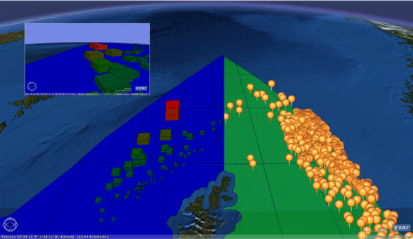
The screengrab below illustrates the differences between a KML representation of polygons and points on the left, and the default AGX representation of the same data on the right.

An additional attraction was that I’d created KML exporters before, but these didn’t display the KML output in the same application – you had to launch Google Earth or AGX. AGX provided the application platform to view a 2D layer, export it to 3D KML then view the result, enabling the process to be iterated in one application, making it potentially far less painful to create an acceptable result.
At this point, I was going to waffle on about ‘Symbolisation of data for presentation’, using phrases and words such as ‘in a static 2D medium’, ‘discovering your data’, ‘whole new realm’, ‘interactive’ and ‘involved’, in an effort to justify the effort I’ve put in, but basically it’s just fun making 3D things, and then flying around them.
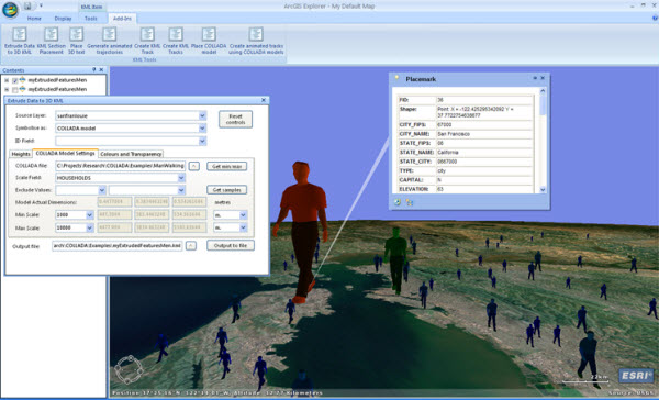
The screengrab below illustrates Californian cities represented by scaled COLLADA models, the height of the models being controlled by the population of the city. Note that the attributes of the input features are also exported, allowing you to click on a feature to view them in a pop-up, as shown.

Anyway, I built the main part of the utility last year. However, having reviewed it, I decided that the output KML really needed to incorporate a legend that described what the styling of the exported features actually represented. Without a legend, the representation of the data within the KML would be at best difficult to decipher, at worst meaningless to anyone other than the creator. A few projects have intervened between then and now, and I’ve only just completed and tested the legend generation routines.
The utility allows you to select numeric attribute fields which will control the height and colour of the output objects. For point and line datasets, you can also control the width of the output objects using another numeric attribute field. For COLLADA models you can control the insertion height and the scale of the model (all dimensions are currently equally scaled). The fields selected can all be the same, or can be different. This, combined with the ability to control the colour of the output objects using another numeric attribute field, enables you to symbolise your data on the basis of up to 3 different attributes. As an example, an oil well could be represented by a column in which daily production controls the column height, total lifetime production controls the column width and the depth of the well controls the colour, ramping from blue to red, from shallow to deep.
My legend display is provided by a three entry legend (low/mid/high) for each controlled parameter – e.g. if you’re controlling height and width by different attribute values, you get two three-entry legend elements. They’re not particularly pretty, but they hopefully serve their purpose.
There are a lot of things that aren’t ideal about the utility, and some bugs, but I hope you find it useful. If you have any suggestions for improvements, please do contact us using the link below. I have included some ideas of my own at the back of the documentation PDF.
[To Download the ArcGIS Explorer data extrusion add-in please see our updated blog post for v1500].
Posted by Ross Smail, Head of R&D, Exprodat.


