Assessing the Quality of the Modelling of Continuous Variables in the 2D Domain – A Deterministic Approach
See Part 1 and Part 2 of the ‘Measuring the Quality of Predictions’ discussion.
Distribution of Uncertainty
Unfortunately, limiting the analysis of uncertainty to the magnitude of the residuals alone is proven to be too limited an approach. Indeed, very useful information can be obtained by looking at the distribution of both predictions and residuals.
A linear correlation analysis is a simple and quick technique which we can use to compare the distribution of observations, predictions and their residuals. By using the correlation concept two indices can be added to our analysis.
The first, called Value Correlation Coefficient (VCC in Table 1), is simply an expression of the linear relationship between predicted and observed values. In this sense we would expect that models showing values of predictions closer to the value of observations to be affected by lower uncertainty than models showing larger discrepancies. The VCC, whose values span from -1 to +1, will therefore provide an indication of how close our predictions are to our observations for the whole of the input point population.
In an ideal world all predictions match the values observed in all the sampled locations and, therefore, the correlation coefficient would be equal to +1. This is obviously not going to happen in the real world so we would like our models to have VCC as close to 1 as possible.
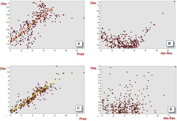
For instance, let’s compare the values of VCC for two of the deterministic models we have derived by using our input point dataset. In Figure 5 below, plots A and C show the distribution of observations (dependent variable) and predictions (independent variable) for two models derived using ArcGIS Spatial Analyst (A = Derived using ‘Natural Neighbor’ algorithm, C = Derived using ‘Spline with Barriers’ algorithm).
The scatterplots shown in Figure 5 are powerful diagnostic tools and can be used to help gain an understanding how a model performs. In our case, note how much more dispersed the cloud of points is for the ‘Natural Neighbor’ than for the ‘Spline with Barriers’ model. The higher correlation between predictions and observations for the latter is reflected by the higher VCC coefficient (0.71) compared to the former model (0.4). Note also how both models struggle to correctly predict values at the higher extreme (points more scattered), and how the ‘Natural Neighbor’ model also underperforms in predicting values at the lower extreme of the distribution.
The last index we want to consider is also a linear correlation coefficient. The Error Correlation Coefficient (ECC) is a measure of the correlation between the absolute value of the residuals and the magnitude of the observations. This index provides an idea of the bias in the residuals and, therefore, how far the population of residuals is from the ideal, symmetric distribution centred on a zero mean and with a minimum spread. These elements are reflected by the ECC being as small as possible, confirming the independence of the errors of predictions from the true values of the observations.
In the example we are considering here note how the residuals are much more dispersed for ‘Spline with Barriers’ (Figure 5 D) than for ‘Natural Neighbor’ (NN) model (Figure 5 B). The latter, in fact, indicates the presence of an inflection or a dip, which may be an indication that a linear model may not be appropriate to describe the spatial behaviour of the variable we are trying to model.
See Table 1 for the ECC values for these two models. You will notice how ECC is higher for NN (ECC = 0.51) than for the ‘Spline with Barriers’ (ECC = 0.32), indicating the latter as a better performing model.

Figure 5 – Correlation coefficients scatterplots for the NN (A, C – VCC) and the ‘Spline with Barriers’ (B, D – ECC) models
Adding the Spatial Component of the Uncertainty to the Analysis
The indices discussed so far do not take into account the spatial component of the prediction errors. Residuals can be expressed not only by their values (relative, absolute) but also by the spatial location where these values occur. Within the context of this discussion it could be extremely useful to map the residuals.
The presence of spatial patterns or spatial clusters of particularly high errors is key information which can be gained by simply putting the residuals on a map. In doing so we not only obtain information on the overall performance of any given model, but also would indentify regions where our models provide more reliable results and areas with high uncertainty which may be worth further investigated.
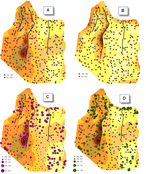
Figure 6 shows the error maps for the ‘Natural Neighbor’ and the ‘Spline with Barriers’ models. Residuals are mapped based on the signed value of errors (maps A and B). Map B shows no detectable patterns of underestimations or overestimations, where signed residuals are distributed randomly throughout the study area. Map A shows how the areas where predictions are underestimated (blue dots) and overestimated (red dots) are quite distinct one from another.
The presence of non-random patterns in the spatial distribution of the signed residuals may be used as an indication that the custom parameters which were used to derive the model need to be revised and require better calibration, or as an indication that the structure of the model is unsuitable to describe the behaviour of the continuous variable.
Graduated symbol maps C and D (Figure 6) show the spatial distribution of the absolute value of the errors. Both show that the regions surrounding major faults are characterised by higher discrepancies between observations and predictions. Note that this is also true for the ‘Spline with Barriers’ algorithm, which can handle faults automatically.
The final scope of the modelling should determine whether the results are acceptable or not. In our case if the scope of the modelling is to obtain a high level of confidence particularly in areas near the source of discontinuity (fault lines, ridges, rivers and other linear features) a more elaborate approach may be needed. This may involve separately modelling distinct regions that are delimited by the fault setting, or using a different interpolation approach altogether, e.g. using geostatistics instead of a deterministic method.

Figure 6 – Mapping the residuals and the absolute values of the residuals for ‘Natural Neighbor’ (A, C) and ‘Spline with Barriers’ (B, D) models
Conclusions
In this three-part series of blogs we have discussed a simple and quick approach to evaluate the quality of the predictions derived from the interpolation of a continuous petrophysical variable.
The methodology is well known and provides a basic approach to compare models generated by using different deterministic algorithms and can easily be added as a key task at the end of modelling workflows.
In our experience of the E&P industry we often see that the results of the modelling process are taken without questioning the validity and the quality of the output. We hope that the “practical cut” we have adopted for this discussion will benefit geoscientists who may have felt uncomfortable with complex statistical concepts and may welcome a more basic, yet still scientifically sound, approach.
If you missed the earlier parts of this discussion you can catch up using the following links:
Posted by Paola Peroni, Senior Consultant, Exprodat.
Paola presented elements of this methodology at the ESRI User Conference, Tue Jul 13th, 2010 (room 28 C), in San Diego.


