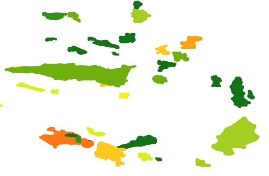
When working with polygon data in ArcGIS Pro, there are cases where polygons sit on top of one another. One example of this is hydrocarbon field outlines in the North Sea. I’ve downloaded some of the OGA field production data and displayed this in ArcGIS Pro. I added a Definition Query to only show oil production for October 2018. I want to visualize this production data for fields, but the polygons here are obscuring some of the data where fields overlap one another.

There are various ways to get around this. I could apply transparency or use symbol levels. Transparency can have performance implications, especially if I want to display the data in a Map Service. Using symbol levels may not work well in this case, either, as there is no clear relationship between the fields and the order in which to display them.
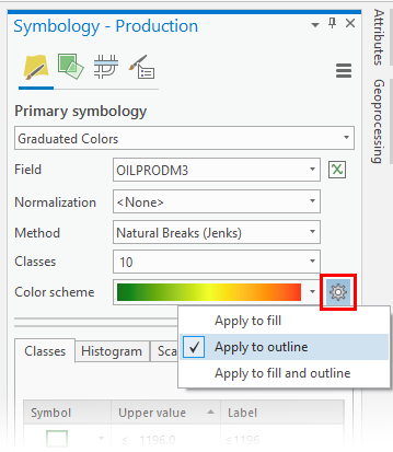
As of ArcGIS Pro 2.3 there is a new way to see all the data in this scenario, which is to apply the symbology to the polygon outline, rather than the polygon fill. If I symbolize the data as usual in the Symbology pane – using Unique Values, Graduated Colors, etc. – I can use the small gear symbol next to the colour ramp to choose how to apply the symbology: i.e. based on fill, outline or both fill and outline.

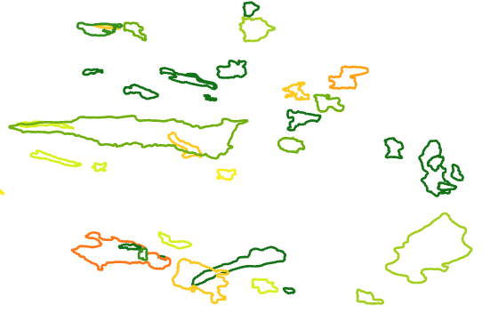
In this case, I choose to Apply to outline and then I get the result below.

This gives a clearer view of the field production data showing fields which underlie others (in drawing order terms, not stratigraphically). In the east of the map, what looked like one field in the polygon fill can be seen to be three fields by outline, for example.
Find out more about how we can help you with ArcGIS Pro.
Posted by Ben Holmes, GIS Consultant, Exprodat


