Traditionally, scale bars are based on the origin point of the map’s coordinate reference system (CRS), commonly the intersection of the equator and Prime Meridian. Many users don’t realise that the scale bar may be inaccurate due to the distortions that occur with any map projection.
In ArcGIS Pro, this inaccuracy can be reduced with the “Compute at center” property, though not entirely corrected for every map
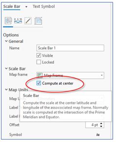
Not all scale bars are the same
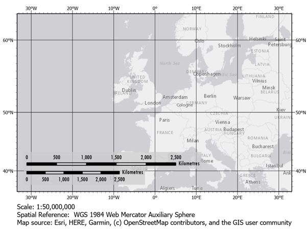
For example, the image below shows a basemap centred on London, approximately 51°N latitude with the WGS 1984 Web Mercator Auxiliary Sphere CRS, which is the standard for ArcGIS Online web maps. Notice the two scale bars. The upper scale bar is set to “Compute at center”, which uses the centre of the map frame to calculate scale, whereas the lower scale bar uses the default setting: the coordinate system’s origin point. In this case, the origin point is the intersection of the equator and Prime Meridian. The two bars imply very different scales!
For the map above, a CRS with a European extent, or even a UTM zone, would produce more accurate results between different latitudes. By simply changing the CRS of the map to UTM Zone 30N – see below – the scale bars will match. However, these results are misleading because even though the scale does not change moving north–south, the scale factor varies moving east–west from the central meridian. Each zone is only 6° wide, so UTM systems should ideally be used for smaller extents because of the increasing deformation outside that region. The valid extent of UTM Zone 30N is shaded green in the image below. Panning the map outside that zone would show a greater difference in the two scale bars.
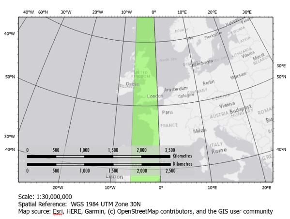
It is important to understand that all map projections inherently include distortion in at least one direction, especially at smaller scales (i.e. continental or world maps). The EPSG Area Polygons dataset is a valuable tool for visualizing the applicable extent of each CRS to find the one most suitable for your map. Using a CRS with a valid area that best matches your own data extents is essential for minimizing distortion, which reduces discrepancies in scale bar distances across your map’s extent.
Map distortion and measurement
Another aspect of a scale bar to keep in mind is that it may only apply to measurements in the east-west direction. Measurements taken north-south may not match with the scale bar.
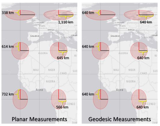
The Tissot Indicatrices below demonstrate that, in some projections, the horizontal and vertical measurements – shown in black and red lines, respectively – do not always appear equal. Each of the lines inside the circles represent the same distance on the earth’s surface. Therefore, using the scale bar like a ruler to measure distances on the map would prove inaccurate.
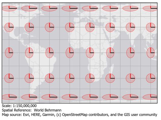
A comparison of measurements of the Tissot Indicatrices shows just how much variation there can be. The planar measurements of the indicatrices – shown below on the left image – show values you would expect if the scale was consistent across the entire map: lines which appear shorter have smaller planar lengths and longer lines have greater lengths. However, this can only be true if the represented surface is flat. The lines only appear to be different lengths because of the various angles at which they are projected. The geodesic measurements take the transformation from the 3D surface into account, resulting in equal line lengths, as the example below illustrates (World Behrmann projection).
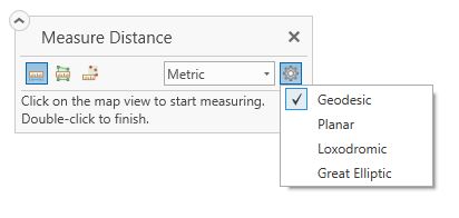
ArcGIS Pro’s measurement tool can be configured for planar or geodesic methods. Planar measurements are based on the same scale as the default scale bar. Using the planar method is the equivalent of using a ruler on the 2D map to measure distances. Geodesic measurements take the datum’s 3D curvature into account and therefore adjust for associated projection distortions, so they are accurate at any latitude and longitude irrespective of CRS. The geodesic method is generally recommended for most applications.
Variable scale bars
One solution to the complexity of scale bars on these world projections is to use a variable scale bar, which is frequently mentioned in Esri’s blogs about scale bars. However, since ArcGIS Pro does not have an option to automatically generate one in a layout, creating variable scale bars is a painstaking – and manual – process. But again, these only identify distances along each line of latitude in a Mercator projection; map distances along lines of longitude or any other angle would not match the given scales, so it can still be misleading.
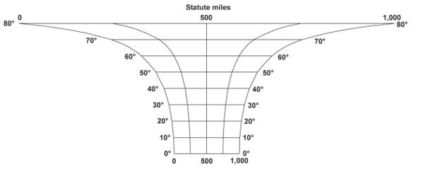
Example of variable scale bar, Mercator projection
Whether maps use a traditional scale bar or a variable scale bar, the accuracy usually only applies to a small portion of the map, especially when zoomed out over a large area. In many projections, scale bars cannot accurately be used as a tool to measure distance between any two points, but they are still an essential element to most maps for representing the general scale of features.
Compute at center greatly improves the accuracy of the scale over the default setting, but it’s still only valid for the centre of the map and possibly only that specific longitude or latitude, depending on the CRS. Any measurements away from the centre may be inconsistent, so it is sensible to include a short disclaimer on map layouts including when using scale bars.
Keeping things in perspective
Keep in mind that the purpose of most maps is not to perfectly represent great distances, but rather present data in a geospatial medium.
Be sure that your scale bars don’t imply that they can be used for mensuration, but rather they are there to provide relative context.
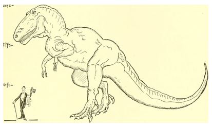
Think of it like a diagram of a dinosaur standing next to a human; it does not intend to provide precise mensuration of anything on the diagram, but rather to demonstrate the relative sizes of the dinosaur compared to the common size of a human. While some projections do allow for accuracy in the accompanying scale bar, especially at larger scales, we advise that you treat them like the human standing next to the dinosaur.
Posted by Alex Rexroad, GIS Consultant/Trainer


