As we progress towards releasing version 3.2 of Unconventionals Analyst for ArcGIS Pro (due out within a few months), I couldn’t help but give you folks a sneak peek of what’s coming your way by sharing some of the new features we are including to help take your gun barrel plots to the next level.
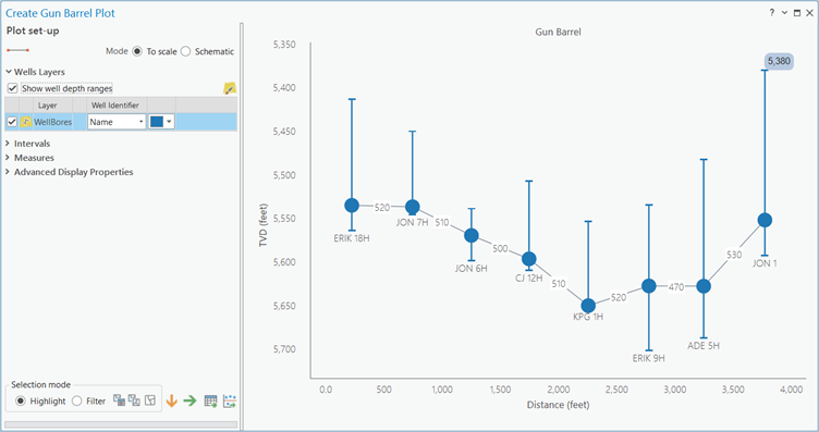
1 – Visualize Ranges of Well Depth
Looking at a gun barrel plot can sometimes make you forget that you’re dealing with wells that are not at the same depth for their entire lateral section. So, we’re adding a feature to let you visualize those lateral depth ranges. Simply tick the new ‘Show well depth ranges’ option on to see ‘box plot’ depth ranges for all your wells. Find out which of your drill teams wins the award for most precise placement!
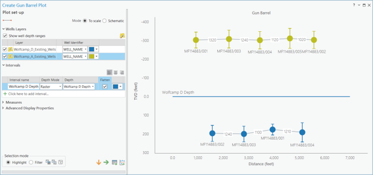
2 – Flatten Your Wells on an Interval
Often you want to see how your wells relate to key geological intervals. To achieve this you may want to flatten a dipping geological surface as this can help better visualize thickness variations, facies changes, etc. So, in v3.2 we’re adding this as a new feature, allowing you to flatten your gun barrel plots on a key surface raster or grid.
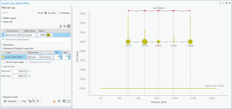
3 – Size Your Well Symbols
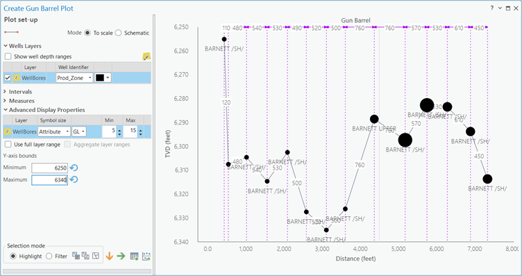
The position of your wells is not the only important information – the performance of your wells is ultimately the thing you want to maximise. In a gun barrel plot a good way to visualize well performance is to size your well symbols. Here, I’ve sized my well symbol points and varied the sizes by the producion for each well allowing me to easily identify that well #35568 has sub-optimal production.
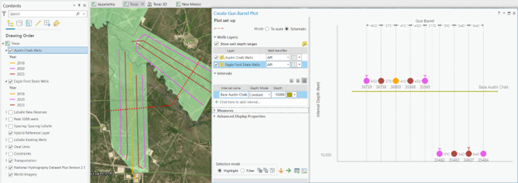
4 – Color Your Well Symbols
Further detail can be conveyed in a gun barrel plot by adding color to your well symbols. Before v3.2, the tool allowed you to match the well plot symbology with a ‘single’ symbology used by your ArcGIS Pro map. To give you more flexibility, you can now match your well symbols to ‘unique value’ and ‘graduated color’ rendering. In the image below, I’ve colored my map wells by year to communicate frac technology types – note how the plot symbology is now consistent with the map.
5 – Control Your Y-axis Range
The final new feature I want to highlight is the ability to control the range of your y-axis – whilst this seems a small feature it’s actually one of the most powerful. Changing the scale is a great way to make your gun barrel plot more undestandable, to leave you more space to annotate, allowing the communication of additional information to flow around the key points of the diagram.
This next version of the gun barrel tool is really exciting us, which is why I wanted to create this blog. We think these Improvements will make these powerful graphical displays easier to create, easier to use and flexible enough to have multiple messages communicated.
Posted by Rich Webb, GIS Software Product Manager, Exprodat


